Hello friends! It’s good to have you join us today on our usual career guides!
This article will teach you the principles or rules you should respect as you take on each graphic design project.
You will also learn how to balance each with the others.
By the end of this article, we are sure that you will be ready to take your graphic design career a step further because of the new things you will learn.
Here is a sneak peek into what we will learn today:
- Graphic design principles explained
- The fundamental principles of graphic design2
- How to apply core graphic design principles#3
Let’s get on with it!
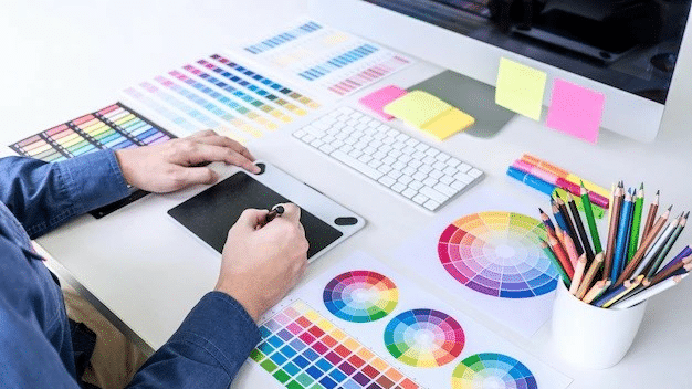
What are ‘Principles’ in Graphic Design?
Principles in graphic design refer to the rules each Graphic Designer should adhere to before they can create or compose something magical, appealing, and effective.
Among Graphic Design Principles are Contrast, Emphasis, Movement & White Space, Balance & Alignment, Proportion, Repetition, and so on.
When you take a good look at everything around you, what do you see? You see designs all around you.
For example, we’re always amazed at how household utensils, clothing, gadgets, and even nature around us exhibit some level of design.
As a Graphic Designer or aspiring Designer, you too will need to make many decisions daily about what your project should look like based on the intended use and your target audience.
Have you ever seen an expert Graphic Designer at work? It looks like everything they do is effortless even though we know it isn’t.
However, this expectation is neither unreasonable nor elusive.
It all depends on how well you follow the rules or principles of engagement when designing a poster, logo, marketing ad, animation, or a simple practice project.
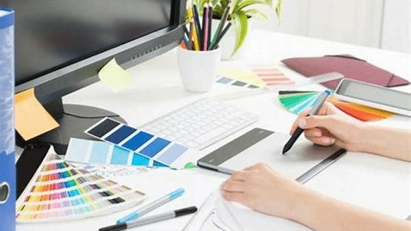
So, before you even go far in your learning of the design processes, you should get a good knowledge of the principles and elements of graphic design.
Graphic Design Elements are components like line, shape, topography, color, size, font, etc.
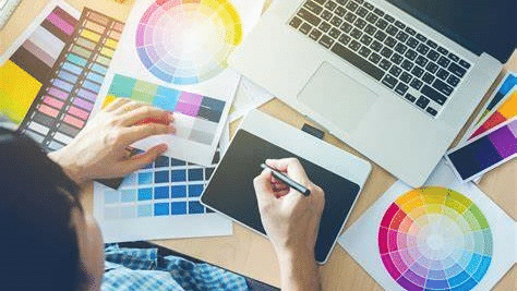
When you follow the rules and consider each element when working on a project, you are sure that your project will come out as planned: elegant, appealing, and functional.
In the remaining part of this article, we will examine these principles.
As we discuss each principle, please do not limit yourself only to a head knowledge but try to put them to use.
And as you use each, you’ll be surprised at how much you would have improved after considering these fundamental principles of graphic design.
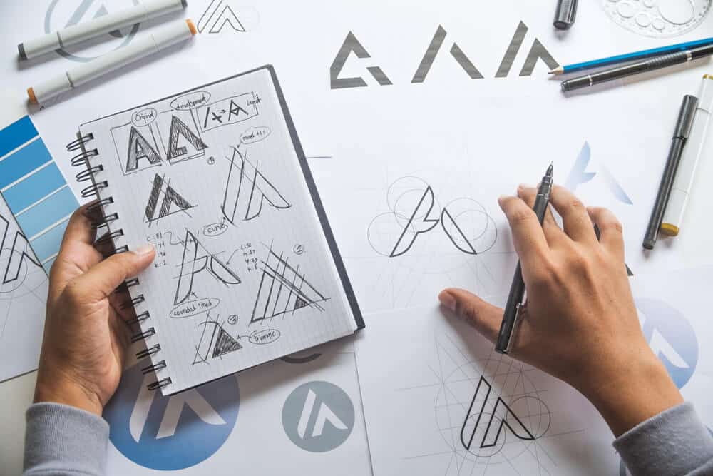
The Principles of Graphic Design Every Designer Should Know and Use
Hierarchy
The first principle of graphic design we will discuss is crucial of the basics you should know.
Come to think of it, if everything on a webpage or poster is given the same importance, none of the components of that page will stand out, and the entire design may be bland.
However, a good design will have the components of the design listed or arranged in order of importance.
In most cases, what you want the audience to focus on will appear first, while other essential points (not as important as the first) may follow.
That is what the principle of hierarchy is all about.
To create hierarchy in your projects, you will need elements like size, topography, visual weight, color, and scale.
With these elements, you can show your audience that the first line carries more importance than the last line of the poster.
With these elements, a part of your project will stand out as more urgent and informative than the remaining part of your page.
When you get a new project, ensure you understand what your client wants.
Ask questions about their intended purpose and goals.
This way, you can help the client determine what part of the design needs to be ahead in the hierarchy.
Once you determine this, you will know what to do first as you approach this task.
Here is another question: how will you know that you have done an excellent job with this principle of hierarchy?
Please take a look at the completed job, then squint as you look at it. If you squint and can still read the essential part of your job, you have done an excellent job.
You can also ask someone you are sure is unfamiliar with that job to read through.
Ask that friend what part he feels is essential.
If they can decode this, you have also done a great job.
Their answer will help you know if you have done an excellent job or not.
Balance
This second principle revolves around design composition.
There are two ways to achieve this: Symmetrical and Asymmetrical.
With symmetrical balance, you look at the elements on both sides of a vertical line.
It is a relatively straightforward way because once you realize that the elements on both sides are the same, you are convinced immediately.
For instance, if there are two rectangular boxes of the same shape and size on both sides of a vertical line, you have achieved your balance regardless of the contents of each box.
However, if the shape and size of both boxes are not the same, you are sure right away that the design elements are not balanced.
With asymmetrical balance, the number of elements on both sides of the vertical line is different.
So how is the balance achieved?
There may be a large box or image on one side, while there is more than one smaller image on the other.
The weight of the elements (smaller images) on the one side must not be heavier than the element on the other side.
For example, if the weight of the single image on one side is 20, the total weight of the smaller images on the other side of the vertical line must not be more or less than 20.
Another way asymmetrical balance between two design elements can be attained is when the line that divides a page is not directly in the middle of the page.
Instead, it is placed where the weight of the elements on the right-hand side is the same as those on the left-hand side.
Each Graphic Designer will decide which type of balance they want.
However, the goal of balance is to bring harmony to your project.
Alignment
Alignment refers to how your design page’s contents (images or blocks of texts) are arranged or lined up.
It is the same as how texts are aligned on a Microsoft word document.
The contents can be aligned to the right, left, or center.
The only difference here is that the alignment is related to the whole design and one another.
How will you know if your content is aligned?
When the design looks disorganized or messy, that is a sign that the elements on your projects are not aligned in relation to each other.
So, take a good look at your design and align each element as appropriate.
To know the best way to align each body text or image, you can consult expert Graphic Designers or simply learn from one of the online Graphic Design Courses available to you.
For example, the headers and subheadings must always be aligned to the center in all projects.
Some online tools make aligning elements in relation to one another very easy.
For example, when using a photo editor, you can always use the provided feature to move the images either to the right or left.
Such software will also alert you when moving the images or texts out of the expected position(s).
Emphasis
Although not one of the basic principles, it will surely catch any audience’s eye regardless of any prior graphic design experience.
As a Designer, certain elements within your design must be emphasized.
The owner or client wants to remember these elements in the design theory the most.
The most emphasized elements are CTA, the headline, or just an image.
All too often, inexperienced Graphic Designers emphasize the wrong elements in a design job, which can distract the audience from the main point or confuse them.
How will you know what element(s) to emphasize in your project?
Discuss with the clients and get to know what elements to emphasize in the design process.
When you have completed your job, take a second look at it.
To emphasize any part of your page, the following graphic design elements will help you:
- Shadow
- Scale
- Color
- Pattern
- White space
- Typography
Proportion
The design scale is also known as the proportion, and this is the size of the contents of the graphic design project you have on hand.
Here is how it works: if there are several objects or images on a page, the largest of these images stands out more, and the audience will quickly notice this in relation to the others.
In like manner, smaller images or objects on a page will also be noticed by they might have less importance to the audience.
When composing the contents of your design page, use this principle (proportion) to stir the viewer’s interest by scaling the more essential objects in your design job.
There is a word of caution, though, when doing this.
Be careful not to scale some objects too much so that the more minor things on the page appear unimportant.
Remember that every object, including the more minor things, is essential, so they too must get noticed.
Movement
This principle of graphic design refers to the movement of the eyes.
However, these are of your eyes but the eyes of the user.
How your design turns out will determine the movement of your user’s eyes across your design,
When your designs are dynamic, there will be a lot of eye movements, but when your creations are stationary, there is a significant reduction in eye movement.
You have done an excellent job of using the elements to create what your user’s eyes will focus on in the path of the eye’s natural movement pattern.
So, how will you go about it? Take some time to study the eye’s natural movement.
The common eye patterns are:
- The F- pattern
- The Z- pattern
- The Layer Cake pattern
The first two patterns are commonly used by designers when creating a page with lots of images.
The layer cake pattern is widely used when creating pages with lots of written contents, paragraphs, headers, and bullet points.
Why not explore the social media pages of expert designers for more ideas on the principle of movement and any related graphic elements?
Proximity
This next Graphic Design Principle will help you organize the objects in your design.
Certain elements must be correctly placed or grouped to make a design more appealing.
There is also a relationship between the objects on the same page.
For example, there may be large and small images on each project.
Suppose several images are jampacked in a specific location.
In that case, a Graphic Designer will use the proximity to declutter the area, adding to the beauty of the overall design.
Designers also use proximity to adjust some aspects of a page to make the page better understandable to the average reader.
To find and use the proximity principle when working on any project, toggle the menu or list.
You can also check the ‘invitation’ on any Graphic Design Software.
White/Negative Space
Some call the next Graphic Design Principle white space; in most cases, it refers to an area on a design project with no design element.
In graphic design, leaving space without any element in it rarely happens.
This element may be a background color.
Most professional Designers use the negative space principle in a project to give other elements around a particular section some “composition room to breathe.”
A page lacking appropriate negative space looks disorganized and heavily clustered.
In terms of user experience, your audience might struggle to navigate the page.
What should you do when working on any project?
Leave some negative space around some of your design elements.
This principle adds to the page’s beauty and makes essential elements easily stand out.
Contrast
When talking about contrast, you already know it has to do with contrasting colors.
As applied to various elements on the design page.
While many people rightly believe that contrast has to do with color, other factors on the design page can create some contrast too.
For example, different elements of different sizes or shapes can create some contrast too in any design.
Contrasts are necessary for any project for at least two reasons:
- They help some elements to stand out and become more prominent
- The second reason is that it improves accessibility
Try and imagine a design without any contrast.
The entire page, the elements of a design job, and everything on the page will contain just one color, both in the background and on the objects.
It will just be bland and not in any way appealing.
But when there is enough contrast, especially when talking about written texts in relation to their background (for example, black text on a yellow or rose gold background), apart from being appealing, it makes the page easily accessible to your intended audience.
Some people have an issue with their vision and may not find it easy to read texts that are small or not too different from the background.
With effective use of contrast, you can quickly solve their problem.
Contrast
As the name suggests, this Graphic Design Principle refers to repeating some aspects regularly throughout the design process.
It doesn’t matter if this repetition is regular or irregular.
Designers use this rule to create some reinforcements in a project and contribute to the unity of the element, while others use this principle to maintain continuity.
It can also create a rhythmic composition that adds to your job’s beauty and appeal.
Its use can be as simple as repeating the same icon or using the same background color or pattern. It could also be how you style some tests or images throughout the project.
Whether it is regular or irregular, be careful so that your repetition does not look too awkward or make your design a little static.
Just how much repetition is needed in each project?
Each Designer will answer this question; however, make sure whatever style of repetition you use helps people remember your project with pleasantness and not disgust.
Be consistent in your use of imagery and fonts.
You can search the line for various repetition templates by professional Graphic Designers.
Variety
This next principle is what keeps your users interested right through your design.
Variety is beneficial when doing various forms of repetition.
Having a variety of repetitions, not just one type, throughout the design will not let your users become bored.
To create repetition, add some unique elements to your work.
Designers use a variety to call users’ attention to specific design aspects.
For example, people pay more attention to bold, italicized, or capitalized texts.
They believe the writer added those important elements to call their attention to something important.
The same way a writer used these varieties to add spice to written contents, give the elements in your design that uniqueness.
Unity
Unity is that rule that creates harmony within your project.
It ensures each element is placed correctly, and the user will not have any problem navigating through the webpage or your design.
It is like a run-through at the end of your project that helps you adjust whatever you need to until every element looks picture perfect.
There are three other Graphic Design Principles where you need ‘Unity.’
They are:
- Repetition: How often do you repeat some elements of graphic design in a specific project
- Proximity: The distance between two or more elements
- Alignment: The right, left, or center alignment of images or texts
Conclusion
That rounds up the information in this guide.
But before you go, do you still remember the principles of graphic design?
We have discussed the following:
- Balance
- Hierarchy
- Repetition
- Proportion
- Alignment
- Contrast
- Emphasis
- Unity
- Movement
- Variety
- White or Negative Space
How you apply these rules in your design will make a difference.
Last but not least, always keep your audience in mind when working on any project because they are the consumers, and if they don’t like what they see, then your efforts have not paid off.
We hope that as you review this guide on the principles of design, you have learned something that can help you improve the quality of your designs.
FAQs
What are Design Elements?
Elements in graphic design refer to the fundamental aspects of graphic design.
They are the bedrock on which everything you do with the actual design rests.
There are seven elements of graphic design.
They are color, shape, topography, value, space, line, and value.
Are Design Elements and Principles the same thing?
No, they are not the same.
Elements are fundamental aspects of graphic designs.
They are the cement, sand, and water needed to make mortar.
However, Graphic Design Principles are the rules of engagement.
To use design elements well, you must adhere to Graphic Design Principles.
How many Design Principles are there?
Although the are conflicting answers to this question, a careful analysis of the subject suggests that they are up to 11 principles in graphic design.
Here are the principles discussed in this guide so far:
– Balance
– Hierarchy
– Repetition
– Proportion
– Alignment
– Contrast
– Emphasis
– Unity
– Movement
– Variety
– White or Negative Space
What are the basic principles of design?
The five core Principles of Graphic Design are contrast, alignment, repetition, white space, and proximity.
They are core principles because all other principles revolve around them.
You can still do without using some principles but not these five.
The five subdivisions of contrast are color, width, size, light, and juxtaposition.
How long will it take for me to complete a Graphic Design Course?
Learning graphic design through a University will take around 4 years.
However, a design Bootcamp certificate program can take between 1 and 12 weeks, depending on the course.
If you have the basic skills and elementary knowledge of graphic design, the amount of time you will spend learning is bound to resume.